
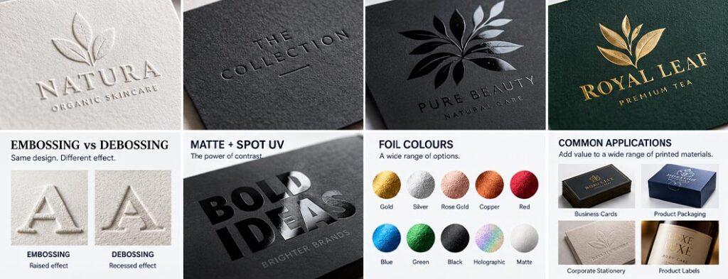
A well-designed piece of printed material can communicate a brand message through colour, typography, imagery and layout. But sometimes the design needs something more.
A subtle raised logo.
A recessed pattern.
A glossy detail against a matte background.
A metallic gold element that catches the light.
These effects are created through special print finishing techniques such as embossing, debossing, spot UV and foiling.
These finishes can transform an ordinary printed piece into something more tactile, distinctive and premium. They are widely used for business cards, corporate stationery, invitations, packaging, product labels, luxury boxes, certificates, brochures and premium promotional materials.
However, these effects are not simply visual filters that can be added at the end of a design.
They are production processes, and the artwork needs to be prepared specifically for them.
Understanding how these techniques work can help designers create more practical artwork, communicate better with printers and avoid costly production problems.
What Are Embossing, Debossing, Spot UV and Foiling?
These are different types of print finishing techniques.
Embossing
Embossing raises selected areas of the printed material above the surface.
Debossing
Debossing presses selected areas into the material, creating a recessed effect.
Spot UV
Spot UV applies a glossy UV coating only to selected areas of the printed piece.
Foiling
Foiling transfers a thin metallic or specialty foil onto selected areas of the substrate using heat, pressure or other specialised processes depending on the production method.
Although these techniques are often used together, they create very different visual and tactile effects.
Why Are Special Print Finishes Used?
Special finishing can serve several purposes.
It can:
- Highlight important information
- Emphasise a logo
- Create visual contrast
- Add texture
- Increase perceived quality
- Create a premium appearance
- Improve shelf appeal
- Make packaging more distinctive
- Strengthen brand recognition
- Create a memorable tactile experience
For example, a business card with a simple embossed logo may feel considerably more premium than the same design printed completely flat.
Likewise, a product package with a matte surface and selective gloss areas can create a sophisticated contrast without requiring additional colours.
The important point is that finishing should support the design rather than simply being added because it is available.nt when a design contains fine details, multiple colours or elements that need to align precisely.
What Is Embossing?
Embossing is a finishing technique that creates a raised three-dimensional area on a printed substrate.
A specially manufactured die is pressed against the material to push the selected area upward.
Depending on the design and production method, embossing may be combined with printing or foil.
For example, a logo could be:
- Embossed without ink
- Embossed over printed artwork
- Embossed with foil
- Embossed against a contrasting background
The result is a tactile surface that can be seen and felt.
What Is Debossing?
Debossing is essentially the opposite of embossing.
Instead of pushing the design upward, the selected area is pressed downward into the substrate.
This creates a recessed impression.
Debossing is particularly effective for:
- Logos
- Typography
- Patterns
- Leather-style products
- Premium packaging
- Business cards
- Certificates
- Luxury stationery
A debossed logo can create a subtle and sophisticated appearance, particularly when used on thick paper or board.
Embossing vs Debossing
The difference is simple:
| Technique | Result |
|---|---|
| Embossing | Design is raised |
| Debossing | Design is recessed |
Both techniques create a tactile result, but the visual character can be very different.
Embossing can make a logo feel prominent and dimensional.
Debossing can create a more understated, elegant and minimalist appearance.
The choice should depend on the material, design and desired brand personality.
What Is Spot UV?
Spot UV is a finishing technique where a glossy UV coating is applied only to selected areas of a printed piece.
Instead of making the entire surface glossy, the designer chooses specific elements to receive the coating.
This creates contrast between:
Glossy areas + Non-glossy areas
One of the most popular applications is:
Matte lamination + Spot UV
For example, imagine a dark matte business card with a glossy company logo.
The logo may appear almost black on black, but the difference in surface reflection makes it immediately visible when the card moves under light.
This can create a sophisticated effect without introducing another colour. or printing process without understanding the production requirements.
What Does Spot UV Look Like?
Spot UV is particularly effective when the goal is subtle contrast.
Common applications include:
- Logos
- Brand patterns
- Product names
- Typography
- Illustrations
- Decorative elements
- Packaging graphics
- Background textures
A common premium effect is to print the entire piece with a matte finish and then apply Spot UV to selected details.
The result is a difference in surface reflection rather than colour.
This is why Spot UV can look very different depending on lighting.
What Is Foiling?
Foiling is a finishing technique that applies a thin foil material to selected areas of a printed piece.
The most familiar example is metallic gold foil.
However, foils can be available in many colours and finishes, including:
- Gold
- Silver
- Copper
- Rose gold
- Metallic colours
- Holographic effects
- Coloured foils
- Specialty finishes
Foiling can create a striking visual effect because the surface reflects light differently from conventional printed ink.
How Does Foiling Work?
Traditional foil stamping generally involves a heated die and pressure.
The die contains the artwork that needs to receive the foil.
When the die presses the foil against the substrate under the appropriate conditions, the foil transfers onto the selected area.
The exact production process can vary depending on the equipment, substrate and type of foil being used.
This means that designers should always confirm the printer’s requirements before preparing final artwork.
Foil vs Metallic Ink
Foil and metallic ink are not the same thing.
Metallic Ink
A metallic ink is printed onto the substrate using an appropriate printing process.
Foil
Foil is a separate finishing material transferred onto the substrate.
Foil can often produce a stronger reflective metallic effect than conventional metallic ink.
However, the choice depends on:
- Budget
- Quantity
- Printing process
- Substrate
- Required appearance
- Artwork
- Production equipment
A designer should therefore not automatically assume that foil is always the better option.
Embossing, Debossing, Spot UV and Foiling Can Be Combined
These techniques do not necessarily have to be used independently.
A premium printed piece could potentially combine several finishing methods.
For example:
Matte laminated card + Gold foil + Embossed logo
Or:
Matte packaging + Spot UV pattern + Embossed product name
Or:
Printed label + Foil logo + Debossed texture
Combining finishes can create impressive results.
However, more finishing does not automatically mean better design.
Too many effects can make a piece visually confusing, increase production complexity and raise costs.
The best premium design is usually selective rather than excessive.
How Should Designers Prepare Artwork for Embossing?
Embossing requires dedicated production artwork.
The printer will normally need a separate representation of the elements that should be embossed.
This artwork may be supplied as a:
- Vector file
- Single-colour artwork
- Separate spot layer
- Mask
- Production-specific file
The exact requirements vary between printers.
For example, the embossing layer may contain only the logo or selected typography.
It should not necessarily contain the entire artwork.
Before preparing final files, ask the printer:
What format do you require for the embossing die artwork?
This simple question can prevent unnecessary revisions.
How Should Designers Prepare Artwork for Debossing?
Debossing also requires a separate production specification or artwork layer.
The designer needs to clearly identify:
Which elements should be recessed?
For example:
- Logo
- Product name
- Pattern
- Border
- Decorative element
The artwork should clearly distinguish the debossed area from the standard printed artwork.
Do not rely on a visual mockup alone.
The production file should communicate exactly what needs to happen.
How Should Designers Prepare Artwork for Spot UV?
Spot UV artwork is generally supplied as a separate mask or spot-colour layer.
The mask identifies the areas that should receive the UV coating.
For example:
Black artwork = Spot UV
Everything outside the mask remains untreated.
Depending on the printer’s workflow, the Spot UV layer may need to be created as a specific spot colour with a designated name.
The exact naming convention is printer-dependent.
Therefore, always obtain the printer’s specification before creating the final production file.
How Should Designers Prepare Artwork for Foiling?
Foiling also normally requires a dedicated foil layer.
The artwork should clearly identify:
Which elements receive foil?
For example:
- Logo
- Headline
- Border
- Product name
- Decorative pattern
A separate vector layer can be created for the foil elements.
The printer may require a specific spot colour or naming convention for the foil layer.
Again, the most important principle is:
Ask the printer for the production specification before finalising the artwork.
Why Vector Artwork Is Important
Special finishing techniques often benefit from clean vector artwork.
Vector artwork provides precise shapes that can be scaled without losing resolution.
This is particularly useful for:
- Logos
- Typography
- Lines
- Icons
- Patterns
- Borders
- Simple illustrations
Raster images can create complications when they are used for dies, masks or production separations.
This does not mean every element must always be vector.
The production requirements depend on the specific process.
But for critical finishing elements, vector artwork is often the safest approach.
What About Very Small Text?
Small text can be problematic with certain finishing processes.
For example, a tiny line of text that looks perfectly clear on a computer screen may not reproduce successfully as:
- Embossing
- Debossing
- Foil
- Spot UV
Fine details can become less defined during physical production.
This is why designers should consider:
- Minimum text size
- Stroke thickness
- Letter spacing
- Fine lines
- Small counters
- Complex typography
The exact minimums depend on the printer and production process.
There is no universal number that applies to every job.
Can Thin Lines Be Embossed or Foiled?
Potentially, but they need to be treated carefully.
Very thin lines can create production problems because the physical die, foil or coating needs sufficient area to reproduce reliably.
A design containing:
- Extremely thin lines
- Tiny gaps
- Very small text
- Fine decorative patterns
should be discussed with the printer before production.
The more delicate the artwork, the more important production testing becomes.
Does Paper Thickness Matter?
Yes.
Material thickness can have a significant effect on embossing and debossing.
Thicker stocks generally provide more opportunity for noticeable dimensional effects.
For example:
300–400 gsm card
may behave very differently from a thin paper stock.
However, GSM alone does not determine whether embossing will work.
Other factors include:
- Paper composition
- Fibre structure
- Coating
- Lamination
- Grain direction
- Die depth
- Pressure
- Design size
The printer should therefore advise on substrate suitability.
Can Embossing Be Used on Laminated Materials?
It can be, but the result depends on the construction of the material and the specific finishing process.
For example, embossing after lamination can behave differently from embossing before lamination.
Some combinations may produce cracking or other unwanted effects.
This is particularly important for premium packaging and laminated business cards.
Always test the proposed combination when the finish is critical.
Can Spot UV Be Used on Packaging?
Yes.
Spot UV is widely used in packaging to create visual contrast and highlight selected areas.
It can be applied to:
- Folding cartons
- Product boxes
- Premium labels
- Sleeves
- Promotional packaging
- Presentation packaging
For example, a matte black package with a glossy Spot UV logo can create a premium appearance without requiring a complex graphic treatment.
Can Foiling Be Used on Packaging?
Absolutely.
Foiling is particularly popular in premium packaging.
It can be used for:
- Logos
- Product names
- Premium product ranges
- Decorative patterns
- Borders
- Certifications
- Special edition packaging
Gold and silver foil are particularly common in luxury packaging, cosmetics, beverages, confectionery and premium food products.
However, the appropriate foil and production process depend on the substrate and packaging construction.
Special Finishes in Product Label Design
Product labels are another area where finishing can significantly affect perceived quality.
For example:
Premium Food Product
Matte label + Gold foil logo
Cosmetic Product
Soft-touch surface + Embossed brand name
Beverage Label
Textured stock + Debossed pattern + Metallic foil
Luxury Gift Product
Dark substrate + Foil typography + Spot UV details
These techniques can help differentiate products on shelves and create a stronger physical brand experience.
However, finishing should always support the product positioning.
A budget product does not necessarily become premium simply because gold foil is added.
Special Finishes in Brand Identity Design
Special finishing can also be incorporated into a brand’s physical identity system.
For example, a corporate identity may include:
- Embossed business cards
- Foiled certificates
- Premium presentation folders
- Debossed stationery
- Spot UV promotional materials
The important consideration is consistency.
If a brand uses a particular finish for important physical touchpoints, that treatment can become part of the brand experience.
However, the underlying brand identity should remain effective even without the finishing.
A good logo should still work in a simple one-colour application. important when developing packaging and product artwork, where printing decisions can affect both appearance and production cost.
Special Finishes in Business Stationery
Business stationery can benefit from subtle finishing.
Possible applications include:
- Business cards
- Letterheads
- Presentation folders
- Envelopes
- Certificates
- Compliment slips
- Invitation cards
For example, a simple business card with a blind embossed logo can communicate quality without appearing overly decorative.
This is a good example of how restraint can make a premium design more effective.
How Much Do Special Print Finishes Cost?
There is no universal price because finishing costs depend on many factors.
Costs can be influenced by:
- Quantity
- Number of colours
- Size of finishing area
- Number of dies
- Type of foil
- Type of substrate
- Paper thickness
- Printing method
- Number of finishing processes
- Setup requirements
- Production equipment
A small embossed logo on a business card may have a very different cost structure from a large embossed pattern covering a packaging box.
Likewise, adding foil to a small logo is very different from foiling an entire surface.
This is why designers should consider finishing during the quotation stage rather than adding it after the print budget has already been approved.
Why Print Finishing Should Be Planned Early
One of the most common mistakes is designing the artwork first and deciding on finishing at the end.
For example:
- Artwork is completed.
- Client approves the design.
- Printer quotation is requested.
- Foiling is added.
- Embossing is requested.
- Artwork needs to be rebuilt.
- Production cost changes.
This can create unnecessary delays.
A better workflow is:
Concept → Material → Printing Method → Finishing → Artwork Preparation → Proof → Production
This approach allows the designer to create the artwork around the actual production process.
Common Artwork Mistakes With Special Finishes
1. Treating Finishing Like a Photoshop Effect
A realistic foil or embossing effect in a mockup does not automatically mean the production artwork is ready.
2. Not Providing Separate Production Artwork
Printers often need dedicated layers or files for each finishing process.
3. Using Extremely Fine Details
Tiny details may not reproduce reliably.
4. Ignoring Material Thickness
Embossing and debossing depend heavily on the substrate.
5. Designing Without Knowing the Printer’s Specifications
Different printers can have different requirements.
6. Using Too Many Finishes
Multiple effects can increase cost and production complexity.
7. Forgetting Registration
Printed elements and finishing elements may need to align precisely.
8. Assuming Every Finish Works on Every Material
Substrate compatibility must always be considered.
9. Not Requesting a Sample
For important premium packaging, a physical sample can reveal issues that are impossible to identify from a screen.
A Practical Artwork Preparation Workflow
Before sending artwork for special finishing, follow this checklist.
Step 1 — Confirm the Printing Method
Find out how the main artwork will be printed.
Step 2 — Confirm the Substrate
Know exactly what material will be used.
Step 3 — Decide the Finish
Determine whether you need:
- Emboss
- Deboss
- Spot UV
- Foil
- Combination finishing
Step 4 — Create Separate Production Layers
Clearly identify each finishing element.
Step 5 — Check Fine Details
Review small text, thin lines and intricate patterns.
Step 6 — Check Registration
Make sure finishing elements align with printed elements.
Step 7 — Confirm Production Requirements
Send the printer a preliminary file and ask for technical specifications.
Step 8 — Request a Proof or Sample
For colour-critical or premium projects, physical approval is highly recommended.
Step 9 — Approve the Final Artwork
Only proceed once the production artwork has been technically approved.
Embossing, Debossing, Spot UV or Foil: Which Should You Choose?
There is no single answer.
Choose Embossing When:
- You want a tactile raised effect.
- A logo needs emphasis.
- You want a premium physical experience.
- The substrate is suitable.
Choose Debossing When:
- You prefer a subtle recessed effect.
- You want a minimalist appearance.
- You want texture without adding colour.
- The substrate supports the process.
Choose Spot UV When:
- You want gloss-versus-matte contrast.
- You want to highlight selected details.
- You want a sophisticated effect without adding another ink colour.
Choose Foiling When:
- You need a metallic or reflective appearance.
- The product requires strong shelf impact.
- A premium or luxury effect is appropriate.
- The substrate and printing process support foil application.
Combine Finishes When:
- Each effect serves a specific design purpose.
- The additional production cost is justified.
- The combination strengthens the brand experience.
DesignzHub Pro Tip
Don’t design the effect. Design the experience.
A common mistake is adding embossing, foil or Spot UV simply because the technology is available.
Instead, ask:
What should the customer notice first?
If it is the logo, perhaps emboss or foil only the logo.
If it is the product name, perhaps use Spot UV to create contrast.
If the packaging needs a tactile element, perhaps use debossing or embossing.
The strongest premium print designs often use one carefully chosen finishing technique rather than several competing effects.
Conclusion
Embossing, debossing, Spot UV and foiling can turn a printed design into a much more tactile and memorable physical experience.
But the most successful results happen when these techniques are considered as part of the design and production process from the beginning.
For designers, understanding these techniques means knowing more than what each effect looks like.
It means understanding:
Artwork → Printing → Material → Finishing → Production
When these elements work together, a simple business card can become a premium brand touchpoint, a product label can stand out on a crowded shelf, and packaging can communicate quality before the customer even opens it.
At DesignzHub, we believe good graphic design should not stop at the screen. It should be designed to work in the real world.
Frequently Asked Questions
Embossing raises the selected design above the surface, while debossing presses the design into the material to create a recessed effect.
Spot UV is a finishing technique that applies a glossy UV coating to selected areas of a printed surface rather than coating the entire piece.
Foil stamping is a finishing process that transfers a thin foil material onto selected areas of a substrate, commonly producing metallic gold, silver or other specialty effects.
Yes. Embossing and foil can be combined to create a raised metallic effect, depending on the substrate, artwork and production method.
No. Conventional gloss printing generally refers to a gloss ink or overall coating, while Spot UV selectively applies a UV coating to specific areas.
Usually, yes. Printers commonly require separate production artwork or layers identifying the elements that need to be embossed.
Spot UV is generally prepared as a separate mask or spot-colour layer identifying the areas that should receive the UV coating. Always follow the printer’s specific file requirements.
Yes. Foils are available in many colours and specialty finishes, including metallic, holographic and coloured options.
No. The suitability depends on the paper thickness, structure, coating, design, die and production process.
They can increase production costs because they may require additional setup, dies, materials or finishing processes. The cost depends on the quantity, substrate, area and technique.
Ideally, no. Special finishing should be considered early because it can affect the artwork, material selection, production method and budget.
Yes. Embossing, debossing, Spot UV and foiling are commonly used on selected packaging and product labels, particularly where a premium or distinctive appearance is desired.
They can enhance the physical brand experience, but finishing alone does not make a design professional. Strong typography, layout, branding, production quality and appropriate material selection remain fundamental.
Related Reading
CMYK vs Pantone: Understanding Spot Colours, Process Printing & Colour Accuracy
CMYK vs RGB: Understanding Colour Modes for Print & Digital Design
Why You Should Avoid Borders in Print Design (And What to Do Instead)
Understanding Dielines: The Blueprint for Perfect Packaging Design
Common Packaging Design Mistakes FMCG Brands Make (And How to Avoid Them)
How to Prepare Your Product for Export with Professional Packaging Design