
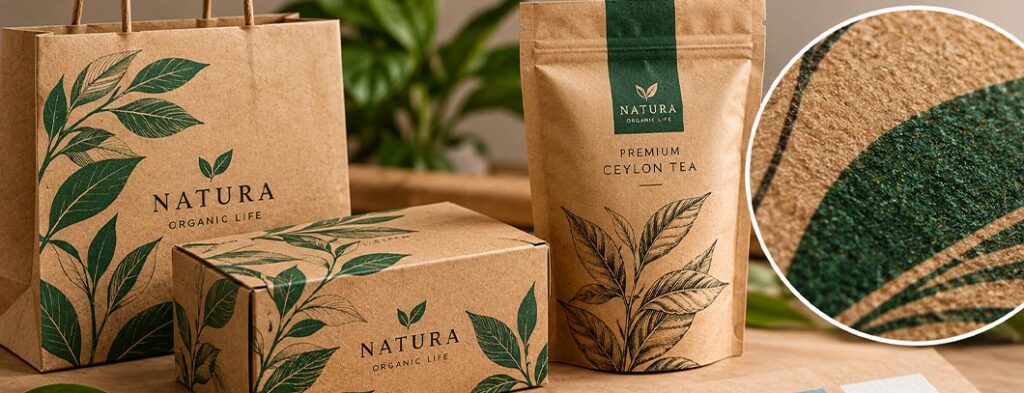
Brown kraft paper is widely used for product packaging, shopping bags, product labels and promotional materials. Its natural appearance makes it a popular choice for brands looking for a simple, rustic or understated design style.
However, printing on brown kraft paper presents a common challenge: colours often look different on brown paper than they do on a white background.
Understanding how the paper affects colour, choosing suitable inks and preparing artwork correctly can help designers achieve better printing results.
Why Do Colours Look Different on Brown Kraft Paper?
The natural brown colour of kraft paper affects how printed inks appear.
CMYK inks are generally not fully opaque, so the colour of the paper influences the final result. Colours printed directly onto brown kraft paper may appear darker, warmer or less vibrant than expected.
For example:
- Light pink and pale blue may appear muted.
- Yellow may lose its brightness.
- Light grey may appear brownish.
- Black and dark green often provide stronger contrast.
- White areas remain the natural colour of the paper unless white ink is printed.
This is why artwork designed on a white computer screen may not reproduce as expected on brown kraft paper.
The key is to design for the actual printing material, not just the digital artwork.
Which Colours Work Best on Brown Kraft Paper?
The most suitable colours depend on the paper shade, ink and intended design. However, several colour approaches tend to work well.
Black and dark charcoal: Effective for typography, logos and simple illustrations.
Dark green and navy: Useful for creating contrast while maintaining a natural or premium appearance.
Burgundy and deep red: Can work well for specialty food packaging and gift products.
Earthy colours: Brown, olive and terracotta can complement the natural appearance of kraft paper, provided there is enough contrast.
Light colours and pastels can also be used, but they may need additional printing considerations to maintain their intended appearance.
Can You Print White Ink on Brown Kraft Paper?
Yes, provided the selected printing process supports white ink.
White ink can be used for logos, typography, illustrations and other elements that need to stand out against the brown surface.
It can also be printed beneath other colours as a white underprint. This creates a lighter base that can help colours appear brighter and more vibrant.
For example, printing orange directly onto brown kraft paper may produce a muted result. Printing a suitable white base beneath the orange can help it appear more vivid.
However, white ink adds production considerations and may increase costs. Always confirm its availability and artwork requirements with your printer before finalising the design.
Choosing the Right Printing Method
The best printing method depends on the artwork, quantity, paper stock and required colour quality.
- Flexographic printing: Commonly used for packaging, paper bags and high-volume production.
- Offset printing: Suitable for certain paper-based commercial printing applications, depending on the kraft stock and press setup.
- Digital printing: Useful for short runs and prototypes when the equipment supports the selected material.
- Screen printing: Can produce bold, opaque colours for suitable paper and packaging applications.
There is no single best method for every project. Discuss the material, quantity and colour requirements with the printer before choosing the process.
For more information, read our guide to Screen Printing once the relevant article URL is confirmed, and our article on CMYK vs Pantone when choosing colours for print.
How to Prepare Artwork for Brown Kraft Paper
A few practical steps can help reduce printing problems.
- Design for the brown background. Consider how the natural paper colour affects every printed element.
- Use sufficient contrast. Make sure text, logos and important graphics remain readable.
- Check white ink requirements. Confirm whether white ink or a white underprint is needed.
- Choose colours carefully. Do not assume that colours will look identical to their appearance on white paper.
- Follow the printer’s specifications. Prepare any special ink layers or separations as requested.
- Request a physical proof. If colour accuracy matters, test the artwork on the actual kraft paper before approving the full production run.
A digital mockup can help present a design, but it cannot reliably predict every characteristic of the final printed result.
Brown Kraft Paper in Packaging and Label Design
Spot UV is particularly effective when the goal is subtle contrast.
Kraft paper can work particularly well for coffee, tea, bakery products, handmade goods, gift packaging and other products that benefit from a natural visual style.
Simple layouts, bold typography, limited colour palettes and well-contrasted graphics can make the most of the material.
However, packaging design involves more than choosing colours. The material, printing process, structure, product requirements and intended use should all be considered together.
Explore our Product Packaging Design services for professionally developed packaging artwork.
For product tags and labels, see our Product Label Design services.
Our Creative Graphic Design services also cover the development of visual artwork suited to its intended application..
Final Thoughts
Brown kraft paper offers an attractive foundation for distinctive packaging and printed materials, but its natural colour directly influences the final printed result.
By choosing suitable colours, considering white ink where necessary and testing artwork on the actual material, designers can achieve more predictable results.
At DesignzHub, we believe professional print design begins with understanding how artwork will work in production.
Design for the paper you will print on—not just the white artboard on your screen.
Frequently Asked Questions
The brown substrate influences the appearance of the ink. Colours printed directly onto it may look darker or less vibrant than they would on white paper.
Yes, but the result may be muted. Depending on the printing process, white underprinting or a lighter substrate may help achieve brighter colours.
Not always. White ink is useful when white elements or brighter colours are required, but simple designs using dark inks can work very well without it.
Black, dark green, navy and selected earthy colours often work well. The best choice depends on the paper and the required contrast.
Yes. A physical proof on the intended paper is especially valuable when brand colours, white ink or colour accuracy are important.
Related Reading
CMYK vs Pantone: Understanding Spot Colours, Process Printing & Colour Accuracy
CMYK vs RGB: Understanding Colour Modes for Print & Digital Design
Why You Should Avoid Borders in Print Design (And What to Do Instead)
Understanding Dielines: The Blueprint for Perfect Packaging Design
Common Packaging Design Mistakes FMCG Brands Make (And How to Avoid Them)
How to Prepare Your Product for Export with Professional Packaging Design