
Project Overview
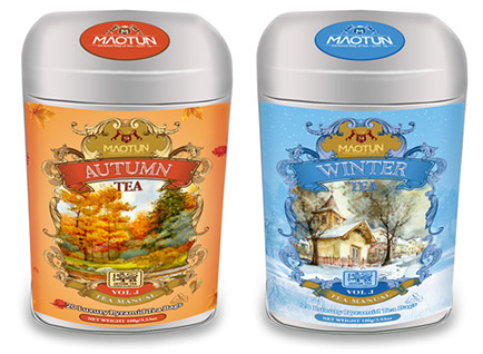
Tea lovers appreciate not just the flavor but also the story behind every blend. For this tea packaging label design, our goal was to create a visually compelling and informative label that reflects the brand’s heritage and quality. The design needed to enhance shelf presence while maintaining a strong connection with the brand’s values.
Our Design Approach
We incorporated a refined color palette and elegant typography to complement the tea’s premium nature. High-resolution illustrations and subtle textures were used to evoke a sense of tradition and authenticity. The label layout was optimized for readability, ensuring important product information is clear and accessible. Finishing touches like matte textures, embossing, and metallic foiling added a touch of luxury.
Final Outcome
The completed tea packaging label design perfectly balanced sophistication and functionality. The brand’s identity was reinforced through strategic design choices, while the label’s premium aesthetics made it stand out in competitive markets. The result was a packaging solution that not only attracted customers but also communicated the tea’s quality and craftsmanship effectively.