
Project Overview
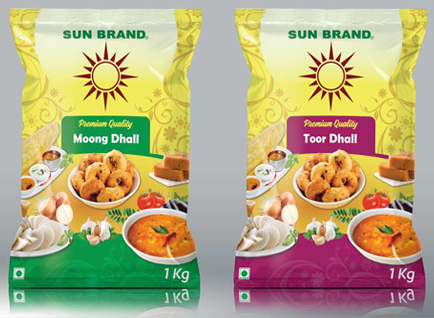
Grain packaging is more than just a protective layer—it represents the brand’s promise of quality and freshness. For Sun Brand, the challenge was to create a packaging design that embodies purity, nutrition, and trust. The design needed to be visually appealing, informative, and capable of standing out in a competitive marketplace while maintaining a connection to natural, wholesome ingredients.
Final Outcome
The Sun Brand grain packaging design captures the essence of freshness and quality with its clean, modern aesthetic. Earthy tones, vibrant imagery, and clear typography ensure an engaging yet professional look. The layout strategically highlights key product benefits while reinforcing brand identity, making the packaging both functional and visually impactful.